This is the Digipak of the Katy Perry album 'Teenage Dream'. As you can see the main theme of the digipak is sweets and confectionary.
The CD's themselves are designed to look like a doughnut and a strawberries and cream boiled sweet. This adds to the overall theme of the Digipak.
This image shows Katy Perry laying on a cloud of candy floss, which matches the video for her song California Gurls. This could have connotations of how 'sweet' she is or in fact, how 'sweet' her life is. The whole digipak seems very light-hearted and fun which could be why confectionary is the main theme, because children are associated with sweets and children's lives are relatively fun and stress-free.
The text and font used on the digipak is red and blue, which are quite masculine colours, stereotypically, however are used in a way to match the theme of blue and red sweets and other confectionary like doughnuts.
The digipak is mostly targeted at females due to the colours used to attract a more feminine audience. Katy Perry's fan base, KatyKats would be a large audience demographic for the Digipak and the album.
However there are two images within the Digipak which sexualise Perry and show her in quite a provocative way, potentially appealing to heterosexual males.
_________________________________________________________________________________
This digipak is very different from the first seeing as the artist and music genres are very different entirely. Kings of Leon are made up of four band members the album cover for their debut album is made up of the faces of the band members and extra eyes which look as if they belong to a bird.
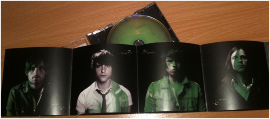
There is a colour scheme to the digipak which is different shades of green.
This creates a theme and a house style for the digipak and this could potentially be the dominant colour for the brand of Kings of Leon. Green does have connotations of jealousy which could relate to some of the music on the album but it also could just be the colour which the band have used as their consistent colouring.
The album name and band name are very small at the top of the front cover to avoid distracting from the image. The images are important for the debut album because KoL would want their audience to know their faces and begin a connection with the band and individual members. Images are remembered better than words so the use of imagery is a good way of keeping their debut album in people's minds and an active way of instigating the Two-Step flow.
On the inside of the digipak the paper unfolds into four squares which each have an image of one of the band members on it. This is again another way of the band members being known individually, by face. This allows for "fan girling" due to the attractiveness of the members and so that all audiences can identify any of them. The same colour scheme of different shades of green has been used on this part of the digipak too to create a consistency and connection between all parts of the ancillary product. The costumes for all of the band members look slightly different, showing individuality and a personal factor to the digipak. The background is black which makes the images of the men stand out clearer and also connotes darker imagery, perhaps in connection to the heavier genre of Kings Of Leon.
Doing these analysis' has made me realise our digipak needs to be consistent and have a theme to bring it all together. This is very important and as well as this is it important that our images used on the digipak are of good quality and are significant to the product.


No comments:
Post a Comment