Wednesday, 1 October 2014

ANALYSIS OF DIGIPAKS


This is the Digipak of the Katy Perry album 'Teenage Dream'. As you can see the main theme of the digipak is sweets and confectionary. 
The CD's themselves are designed to look like a doughnut and a strawberries and cream boiled sweet.  This adds to the overall theme of the Digipak. 

This image shows Katy Perry laying on a cloud of candy floss, which matches the video for her song California Gurls. This could have connotations of how 'sweet' she is or in fact, how 'sweet' her life is. The whole digipak seems very light-hearted and fun which could be why confectionary is the main theme, because children are associated with sweets and children's lives are relatively fun and stress-free. 

The text and font used on the digipak is red and blue, which are quite masculine colours, stereotypically, however are used in a way to match the theme of blue and red sweets and other confectionary like doughnuts. 

The digipak is mostly targeted at females due to the colours used to attract a more feminine audience. Katy Perry's fan base, KatyKats would be a large audience demographic for the Digipak and the album.
However there are two images within the Digipak which sexualise Perry and show her in quite a provocative way, potentially appealing to heterosexual males. 

_________________________________________________________________________________


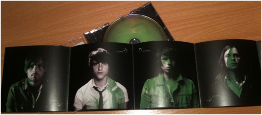
This digipak is very different from the first seeing as the artist and music genres are very different entirely. Kings of Leon are made up of four band members the album cover for their debut album is made up of the faces of the band members and extra eyes which look as if they belong to a bird. 

There is a colour scheme to the digipak which is different shades of green. 
This creates a theme and a house style for the digipak and this could potentially be the dominant colour for the brand of Kings of Leon. Green does have connotations of jealousy which could relate to some of the music on the album but it also could just be the colour which the band have used as their consistent colouring. 

The album name and band name are very small at the top of the front cover to avoid distracting from the image. The images are important for the debut album because KoL would want their audience to know their faces and begin a connection with the band and individual members. Images are remembered better than words so the use of imagery is a good way of keeping their debut album in people's minds and an active way of instigating the Two-Step flow. 

On the inside of the digipak the paper unfolds into four squares which each have an image of one of the band members on it. This is again another way of the band members being known individually, by face. This allows for "fan girling" due to the attractiveness of the members and so that all audiences can identify any of them. The same colour scheme of different shades of green has been used on this part of the digipak too to create a consistency and connection between all parts of the ancillary product. The costumes for all of the band members look slightly different, showing individuality and a personal factor to the digipak. The background is black which makes the images of the men stand out clearer and also connotes darker imagery, perhaps in connection to the heavier genre of Kings Of Leon. 

Doing these analysis' has made me realise our digipak needs to be consistent and have a theme to bring it all together. This is very important and as well as this is it important that our images used on the digipak are of good quality and are significant to the product. 


2 MAGAZINE ADVERTISEMENT ANALYSIS'


The thing that stands out the most for this magazine advertisement is the use of bold lettering the clearly display the name of the artist at the top. This is the first album of 'Lana Del Rey' since her performing stage name changed from 'Lizzy Grant' the the clear lettering may be to capture attention under a new title. The use of colours is reverse between the artist title and the album title.
The title colour is white so it contrasts, yet compliments the blue background of the sky whilst the effect is subverted so the words 'born to die' are in a sky blue against the white of Del Rey's shirt. This is to avoid distraction and make the magazine advertisement clear and readable.
 

The photo used for the magazine advertisement is the same as the Born To Die album cover, showing connection between the products and increasing the brand of Lana Del Rey. The image of herself used is quite polaroid-esque quality which matches the vintage, indie, smooth music which she creates. The colours are all quite soft and the magazine advertisement as a whole is quite relaxed, in colour.

The font used for the magazine advertisement is italic when the album information is stated. The italics look quite sophisticated which reflects the sophistication of the album. The text includes the hit singles which are featured on the album, advertising the album to people who may not know Del Rey, but know the singles. In the bottom right hand corner there is the record label logo so audiences are aware who Del Rey is signed to and across from this is her website address, so fans and new audiences can learn much more about the brand of Lana Del Rey.


This magazine advertisement of Rihanna's album is a lot more basic than Lana Del Rey's. However, the font used and the monochrome colour scheme is a lot edgier perhaps signifying her edgy music which can be heard on the album. 
The 'R' symbol which can be seen in the top right hand corner is important because it has ambitious meaning. It could stand for Rihanna but it also could be associated with the albums title 'Rated R' which plays on both the American certification and Rihanna's name. Again, going with the alternative style, the R looks like it has been carved or cut into the wall. 

Rihanna's name and the fact that it is her new album are clearly displayed in a highlighted font so that they are not missed. This is because the name is also the brand name so it is an important part of the promotional value and marketing strategy. The black and white theme which seems to be a major part of the advertisement is due to the edgy punk-esque style which captivates the advertisement as a whole. 
Rihanna's overall look is very punk-rock because of her jewellery; rings, big earrings and metal bracelets and heavy eye and lip make-up. This could be because the album is "Rated R" it is for a more adult audience, so Rihanna has gone for a more adult aesthetic. 

The two songs (singles) from the album which are being enthusiastically promoted are in a red font. Both the names are quite hard hitting - Russian Roulette being a dangerous game and the word Hard having many ambiguous connotations. The red font could connote many things, danger, promiscuity, blood, for death or pain and overall the effect makes the words stand out on the black and white advertisement. They would be well known songs, as singles which have been released from the album, so they need to be advertised an promoted so audiences can make the connections and purchase the album, increasing sales. 

I chose to analyse this magazine advertisement against the Lana Del Rey one because they are both very different, the colouring is different and the connotations are completely different. As well as this I wanted to point out that Rihanna's advert doesn't have any website informations, record label information or any release dates for the album. These things are all important for a magazine advertisement and although I will take inspiration from them both, I will also learn from them. 


Tuesday, 30 September 2014

WHAT IS A DIGIPACK? WHAT IS A MAGAZINE ADVERTISEMENT?

Digipacks typically consist of a gatefold (book-style) paperboard or card stock outer binding, with one or more plastic trays capable of holding a CD or DVD attached to the inside.
This is an example of a Digipack, showing that the artwork all connects and the actual disks are in the centre, with artwork incorporating all the pieces together. A digipack is important because it helps promote the artist, artistically. As well as this it helps to make money, establishes artist genre and builds a fan base due to visual imagery of the artist. The digipack is a vital piece of our coursework because it is an extension of our music video, creating a whole product to market our artist.
A magazine advertisement is a page in a music magazine which features artist information and promotes a song, album, concert, tour or appearance. This example is of a Jessie J magazine advertisement which promotes her debut album including her international smash single Price Tag.
   

The importance of a magazine advertisement is that it is incorporated into a separate type of media so the synergy creates a wider audience for the marketing strategy and a more successful promotion. With our magazine advertisement we will be promoting the artist and their new single/video which we are creating a video for. The house style must be consistent between the advertisement, video and the digipack so all products create a whole brand. 

Doing this post has helped me realise how important both the Digipack and Magazine Advertisement are and to remind myself that our group need to not completely focus on the video and divide the tasks between us. 

Monday, 29 September 2014

THE CULTURAL EFFECTS MODEL

The Cultural Effects Model is a theory which suggests that media influence on audiences isn't immediate but actually works over a period of time. This has been associated with Neo-Marxism and has been known as the 'Drip, Drip, Drip Effect'. When compared to Music Videos it can be seen in both lights. Cultural stereotypes and trends which can be seen in music videos can affect audiences and influence their behaviour while music videos also adapt and are based around cultural trends and celebrity influence.

A prime example of the Cultural Effects Model in use within Music Videos is the raised expectation of 'beauty' and attractiveness when it comes to both men and women. This includes, weight, body types, muscular definition and facial features. 


The music video for Can't Remember To Forget You by Shakira ft. Rihanna is based around the attractiveness of both female artists. The song has no relation to the sexual nature of the video and the sexualisation of both women is the almost a distraction from the song and the lyrics. The view of the 'Ideal Woman' in society has been changed by music videos like this where the artists rely on being seen as attractive rather than talented. 
The ideological representations of sexual attractiveness and how women are seen in this video implies that women have to be of an extremely high standard in all aspects of beauty to be considered 'ideal'. 

This theory also applies to men, which is clear by the amount of music videos led by male artists in which semi-nudity is also a necessity. 

Jason Derulo in his video for Trumpets can be seen topless quite frequently to display his abs and overall muscularity. This, just like with women, our beliefs and values are altered by this long-term exposure to men and women in such amazing physical condition that it influences society's expectations of people and how attractive they have to be to be attractive. 
 
Our music video is going against the rising cultural stereotypes that are evident in music videos and other mediums. Our narrative involves our main character of an average build for a teenager dressed in pyjamas, exploring his environment. We are not relying on baring skin or showing flesh to create an audience for our video because we want our video to reflect the lyrics and feel of the song. Being semi-nude will not fit into the ideologies we have in mind to show supernatural activity and creepy spiritual activity.

Saturday, 27 September 2014

LIP SYNCING AND IT'S IMPORTANCE

Lip-syncing in music videos is the art of matching up the song and the lyrics of the song to the artist or actors miming the words. This creates the feel that the music video is live and that the song is actual being sung by the artists in that moment of watching the music video. It is the technical term for matching lip movements with sung or spoken vocals. It is important that lip syncing isn't out of time otherwise it can mess up a whole music video.

Some of the best lip-syncing can be seen in Rap music videos. Due to the fast lyrics and fast tempo of music it can be very difficult to edit the music video and song together to match and also to film in the first place. From doing our own lip sync video we realised how hard it is to lip sync words without singing them properly.


It is common that only minimal parts of rap lyrics will be lip synced and that the majority will be narrative based or only less than a seconds worth of lyrics will be lip-synced at a time. This can be seen in Berzerk by Eminem.

Another good example of lip syncing is Emma Stone and Jimmy Fallon's lip sync battle on his talk show.
 
It may not be a music video but I think it really displays how difficult lip syncing can be and how good it looks when done in perfect timing.

The importance of lip syncing lies in the controversy of bad lip syncing. Beyonce among many artists has been accused of lip-syncing and be blasted for being 'fake' and a 'fraud' because of it.


As you can see, lip-syncing is very important in live performances as well as in music videos.

It is important for me to have researched for this task because now I know how important lip-syncing is and even in music videos it needs to be spot on for the flow of the music video and the synergy between music and visuals. Without perfect lip-syncing the whole video will be distracted and it will greatly take away from our piece of work.


LOCATION RESEARCH

For our music video we have chosen the song Trials Of The Past by SBTRKT. Due to the eery vibe of the Indie Pop song we have come up with an idea of a dark woods at sunset, leading into night time. There are woods near where we all live so I have been location scouting and taken some pictures of the woods we are thinking of using.


These are the images I have acquired of the location we were thinking about using. I got a close up and an establishing shot so it would give more information when it comes to decided on a location. My initial thoughts are that although the forest is a nice scenery and would work well, it may be difficult to film at night. Without the sunlight to our advantage we would have to improvise and somehow produce a light to shoot our music video. The forest was a good location for our video because the song is quite creep and our initial idea was to create a video with a main character who is lost and cannot find his way home, or understand where he is.
 

Thursday, 25 September 2014

MUSIC VIDEO ANALYSIS FROM CHOSEN GENRE


Visual Codes

The whole video has quite a retro feel, with some of the objects that can be seen being very vintage. This links to the clothing that the main characters are wearing as well as the objects which are from an earlier period. There are quite a lot of bright colours used in the music video to connote the positive atmosphere within the video.


There is typography used in the video, 16 seconds in, this is the title of the song and the name of the band who perform the song.
The font resembles 'junk' which has been made up into words, this references to the garage sale that is happening in the music video, creating a link between both elements of the same product.  
The collection of retro and vintage objects which can be seen have nostalgic connotations which reflect the message of the song.
This image of the old style projector is an example of the retro technology which is seen in the video.
 
 
Technical Codes
 
One of the interesting camera shots used in the video is a close up on a tape the male characters find.
The tape reads 'Capital Cities, I Sold My Bed But Not My Stereo' which is the name of this song and the artist singing it. This is a way of breaking the 4th wall which gives the video an interesting dynamic.
This shot shows the characters dancing and singing along to the song. The long shot shows the characters amongst the other vintage items in the garage sale and their attire. At this point the music video becomes more of a performance video than narrative because the aspect changes and the male characters, who were playing anonymous roles, become the stars, as themselves.
The lights for the projector, lamp and stereo all turn on and off in sync with the music, this references to Andrew Goodwin's theory that the visuals on screen possess a connection with the melody of the song.
This is the example of the lamp which was flashing on and off in time with the music.
 
The editing is very fast paced and cut in time with the change of the music. Some shots last for less than a second due to the rising tempo of the music and the exciting nature of the video. In the second minute of the music video there is a lot of zooming out processes used to create effect. The shot starts off in a close up on the television screen and ends with the shot further back showing all of the older technology.

 
This is quite an artistic effect and also quite gimmicky, it could be described as a convention for the band because of their nonchalant, fun style of music and attitude within the music video.
 
Genre
 
The genre of the video is predominantly indie. Showing the connections with this artist and our artist SBTRKT. However our artist is more Electronic Pop which is also a slightly more mellow song whereas this Indie Pop could be considered happier and a lighter style of music. The genre and style of this version of Indie music requires a light-hearted music video. This means there is no pressing issues featured in the music video just as in the actual song.
Quite expected is the use of the cliché technique that the whole music video has been imagined, almost like a dream sequence. This is very abstract and creates a diverse effect for the whole music video. This could be considered subverted as the music video is on a high, until the realisation that it wasn't real.
 
Narrative
 
There isn't a specific narrative to the video because it is mostly performance based, however, the loose narrative shows the two main characters, who are the member of the band are searching through a garage sale and find a tape which has their own song on it. After this, they break into song and performance accompanying their own music in different situations. They begin by performing on the garage floor and then the video shows them in different television and computer screens whilst the setting changes. The setting changes due to the hue in the lighting while it changes from a brighter more inviting colour to a darkish blue.
 
Organisations
 
Capital Cities are signed to both Lazy Hooks and Capitol Records meaning they are both independent and mainstream. As artists, they are independent when it comes to their niche market but are distributed worldwide by their mainstream record label. Capitol Records probably provided the big budget which would have been required to shoot this complex video. As well as props like all of the technology used, there is special effects used to display the music video within the music video on an old television screen. The song first came to rise with its commercial success being featured in the German Vodafone advert, then topping the German music charts. Lazy Hooks specialise in music for advertisement, which is how Capital Cities managed to have their song on the advert for Vodafone.
 
Audience
 
The audience figures are quite large, due to the 145 million views of the official music video for the song on YouTube. This demonstrates quite a big fan following due to the mainstream record label, Capitol Records. The video would attract an older audience than the song itself. Although the Indie Pop song is aimed for an audience ranging from ages 15-30, the use of vintage technology and olden day appliances in the video could spark interest for older generations. This would lead to the Two-Step Flow, advertising and promoting the video through word of mouth.
 
Representations
 
There are no social representations due to the light-hearted nature of the song. However there are representations of the past with the props and settings.    
      
This screenshot shows some of the 80's paraphernalia which incorporates into the video. The pink flamingos and poker cap are both reminiscent of the 80's.