Friday 17 October 2014

MAGAZINE ADVERTISEMENT PLANS


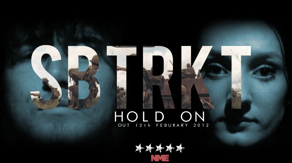
This is my first attempt at a magazine advertisement. I have used Stock Images from the internet to create the same sort of gesture as our video - that a ghost will be involved with a person. I used Photoshop to create this magazine advertisement and there a lot of things which are lacking from my design. The green artist title is a difficult colour to read against the black background whereas the white is much clearer. The fonts are a bit too basic for a music magazine advertisement. The information is lacking and there is no record label logo to indicate which label SBTRKT are with. However, things which I did that I liked were the black and white effect on the 'ghost' to show he is a ghost and different from the full coloured man. I think my image choices are alright because I picked images which would connect in a way that would portray them looking at each other. They don't have a white background because I used to tools to get rid of the background. To improve the magazine advertisement I think more detailed information needs to be added and perhaps more interesting visuals.

Since doing the first magazine advertisement I have designed another one with much more detail and more sophisticated aesthetics.

I am much prouder of this magazine advertisement since I have developed my Photoshop skills. It is much better than my first one with more detail, information and better images. I have included a Young Turks logo and a quote from a music magazine to promote the single. One thing I really like which I have done is make the middle part of the title black to contrast the white and make it clearer against the background. The background of the road and the forest incorporate into the house style of all three products. Our video is based in a forest and features an abandoned road whilst our digipack also has images of trees and creepy forests on it. I used a black and white theme for the majority of the writing to match the record label logo and so it isn't too over-powering over the top of the background. However, to make the artist name stand out I used an effect which is a mix of colours to amount to something a bit different from the rest of the fonts and colours. I'm glad it doesn't clash with the background, however that is personal opinion, some people might think it does.


ANALYSIS OF A MAGAZINE ADVERTISEMENT OF OUR CHOSEN ARTIST


This is the advertisement from NME magazine which is promoting the release of our artist's new song which was released in February 2012. The font for the advert is quite basic due to the fill effect which encompasses the images of a modern day battlefield. This is useful because an overpowering font would distract from the symbolic imagery used. The song is called 'Hold On' which is ambiguous when it comes to the deeper meaning. One meaning could reflect the struggles of the soldiers used on the advertisement, telling them to 'Hold On'. The contrast in colour between the battlefield image and the man and woman behind the text could show the ambiguity and how the song also references to a couple and perhaps relationship struggles, making 'Hold On' another accurate term. The faces are shown through a blue tint creating quite a ghostly effect, shrouded by black to create an overall dark image with negative connotations.

The font for the magazine advertisement is quite basic and bold which is the norm for SBTRKT and their other forms of advertising. There is usually more of an artistic style to the font but this has been abolished for the magazine advertisement because there is imagery inside of the text. A normal, non-distracting style is best for this reasoning so the picture can be seen clearly.

There is a blue hue on the face of the woman in the magazine advertisement. This connotes depression and sadness which relates to the emotional song. Blue also has a calming effect which could reflect the slow tempo of the song and create an overall relaxed mood against the harsh war imagery. The blue face fades in to a black background which creates an effect of fading away or fading into an abyss.    

The war imagery has quite a harsh effect and really impacts the audience due to the severe nature of war and the battlefields. The term 'Hold On' could be about the current soldiers "holding on" in their lives while fighting in the war. The realism of the musky image of the army soldiers creates a true-to-life, hard hitting representation of the war which can be generalised to any audience due to the vast amount of wars going on all over the world.    

The thing I like the most about the whole magazine advertisement is that the symbolic and ambiguous nature of the design draws in a wider audience due to the vast meanings and significance it could possess. I have been inspired by this magazine advertisement and hope our ancillary tasks create such an effect.  


Tuesday 7 October 2014

2 DIGIPAK PLANS

 
This is my first Digipak design which I made in Photoshop. While I like the ghostly image I have used for the track list page I think, now looking back on it, that all of the images are a bit muddled and don't flow together well. The colours are quite clashing and all of the images are slightly opposing. The theme is still relevant and transcends through the digipak but I think I should have decided on a theme and stuck with it. I do however, really like the inside image of the forest with the log cabin which would be where the CD is held, it has a very eerie vibe to it which I think it necessary for the product.  


This is the new Digipak I have created which folds into a 6 panel, the same as my original one. I used a Black and White effect to add an edgy feel to the Digipak so it matches the edgy feel of our song and video. I used images of forests and lonely roads because that is what will be featuring in our video as stated in our proposal, shotlist and storyboard. I incorporated the Young Turks record label logo to create authenticity for the Digipak. As well as this I found an image of a barcode to make the Digipak look like a real Digipak. I thought too much black and white would make for a slightly boring overall effect so the front cover is of colour and I found an effect which gives the cover a surreal vibe, linking to the ideology of our video. I tried to find fonts similar to the original SBTRKT font because it works really well for the artist. The contrast between colour and black and white also represents the contrast between our two characters, the human Tom and the ghost Tom. To give an overall authenticity and realness to the Digipak I included a tracklist with 4 songs to make the Digipak appear to be for an EP.    


Friday 3 October 2014

ANALYSIS OF DIGIPACK BY MY ARTIST


This is some of the album art for SBTRKT's digipack. This is our chosen artist for our music video so our digipack will be similar to this. Our song Trials Of The Past features lyrics which refer to ghost-like entities. The image on the front is the SBTRKT logo which is of a native tribal mask designed by anonymous designer and visual-art director A Hidden Place. The album art features the SBTRKT logo.
The font is quite different to most fonts and it reflects the genre of the music. SBTRKT are an Indie Pop band so they are different to the mainstream Pop music so it makes sense that the font would be different too. The 'B' and 'R' are filled in so that the logo is block colour and the majority is black, a dark colour which goes with the style of music. The simplistic white font on the black background of the digipack stands out and makes the tracklisting and the artist name clear. It also says what number track each song is and how long it lasts for. 

The thing that stands out the most is the native tribal mask which is the iconography associated with SBTRKT and which will need to be included or used as inspiration for our own Digipak for SBTRKT. The house style will have to incorporate similarities between the Digipak, Magazine advertisement and the overall aesthetics of the music video itself.
 
As you can see from the close up screenshot, the Young Turks logo is used in the bottom left corner of the digipak. This is quite common for record labels to put their stamp on their artist's albums which is something we will consider for our own digipak.
 
The use of the tribal mask on the digipak is significant because it is popular iconography for the artist SBTRKT. The artist logo can be seen everywhere and I would like to reproduce something similar. We have decided as a group that due to our music video being set in the forest, images of woods and forests are a great connection to make the house style between our video and ancillary products consistent.
 
Unlike this Digipak, I will want more details on our own like a website address, record label and artist information and perhaps track information. I appreciate the use of monochrome colours and will want to replicate the black and white colours to keep the basic, simplistic feel of the Digipak because the colours are also associated with the genre of music and look of the artist. 

Doing this task has helped me because now I know about the artist in more depth so it will be easier to work on creating a Digipak for the song Trials Of The Past. Analysing my first Digipak has shown me what is used on them and what things make a great Digipak, inspiring me to create a great one for my coursework. 


Thursday 2 October 2014

LYRIC ANALYSIS AND THEIR IMPORTANCE + PITCH IDEA BASED ON LYRICS

"Like A Prayer"

Life is a mystery,
Everyone must stand alone
I hear you call my name
And it feels like home

[Chorus:]
When you call my name it's like a little prayer
I'm down on my knees, I wanna take you there
In the midnight hour I can feel your power
Just like a prayer you know I'll take you there

I hear your voice, it's like an angel sighing
I have no choice, I hear your voice
Feels like flying

I close my eyes, Oh God I think I'm falling
Out of the sky, I close my eyes
Heaven help me

[Chorus x2]

Life is a mystery, everyone must stand alone
I hear you call my name
And it feels like...

[Chorus x2 (with Choir)]
(Just like a prayer, I'll take you there
It's like a dream to me)


This hit Madonna song has very deep lyrics which can be interpreted in different ways. However, the repetitive use of the word 'mystery' creates an image of a mystical element to the song, perhaps supernatural. Imagining a video based on these lyrics I would assume there would be a lot of blue colours, almost cosmic to connote a sense of spirituality. The supernatural element is highlighted by the lyrics 'In the midnight hour I can feel your power'.

A lot of emotion is envisioned from the lyrics such as 'I hear your voice, feels like flying' which develops a sense of romanticism within the lyrics. Use of the word flying also creates another ideology of supernatural powers or perhaps hyperbolic language to convey a metaphor. 

There is also a religious aspect to the Madonna lyrics with the repetition of the word 'Heaven'. As well as this other words like 'God' and 'Prayer' build a semantic field of Christianity portraying a certain ideology to the audience. 

These lyrics are important because without a music video to accompany them they have to build their own narrative clearly. As well as a narrative, a portrayal of a deeper message has to be conveyed to the audience. Doing this task has helped me to understand the importance of lyrics and how difficult they can be to decipher. Due to this, the song we choose to create a video for will have to have lyrics that can be understood by a wide range of audiences who will be targeted by our music video. 
For the previous Madonna lyrics, if I was to pitch a music video idea I would use a dark coloured room, perhaps green-screened to create an open and vast effect. With blueish hues and mystical iconography like stars I would create a space-like set which would deliver a supernaturally enforced location. In accordance to the use of religious terminology in the lyrics, I would avoid the popular cultural trends of nudity and sexuality explicit themes of today's Pop music videos, thus making a clean music video which can deliver a moving performance. Performance shots are important in such an emotional song and I envision close ups of the lead actress lip syncing some of the verse lyrics while the chorus would predominantly be accompanied by an emotional slow dance or narrative shots of the female singing, facing upwards.

 
Much like Belinda Carlisle's video for 'Heaven Is A Place On Earth', which delivers a similar message, I would want something similar with Madonna lip syncing the song. This gives my pitch idea some intertextual references already and a good basis of structural ideas. 

Doing this task has helped me realise that music videos are difficult to create because the reception of audience is vital and music videos can easily go wrong. Also, dependent on the lyrics it is questionable whether there should be a link between lyrics and video. If a song lyric is metaphorical it would be more successful for the actors to either just lip sync or act a scenario of what the metaphors deeper meaning is. For example in the Like A Prayer lyric 'feels like i'm flying' it would be better to either show Madonna lip syncing or emotionally pushing her arms in the air than to harness her up and try to create a scene of her actually flying. My idea pitch has shown me that it is important to be creative and artistic yet practical, a good thing to keep in mind for when I shoot my own music video. 

Wednesday 1 October 2014

ANALYSIS OF DIGIPAKS


This is the Digipak of the Katy Perry album 'Teenage Dream'. As you can see the main theme of the digipak is sweets and confectionary. 
The CD's themselves are designed to look like a doughnut and a strawberries and cream boiled sweet.  This adds to the overall theme of the Digipak. 

This image shows Katy Perry laying on a cloud of candy floss, which matches the video for her song California Gurls. This could have connotations of how 'sweet' she is or in fact, how 'sweet' her life is. The whole digipak seems very light-hearted and fun which could be why confectionary is the main theme, because children are associated with sweets and children's lives are relatively fun and stress-free. 

The text and font used on the digipak is red and blue, which are quite masculine colours, stereotypically, however are used in a way to match the theme of blue and red sweets and other confectionary like doughnuts. 

The digipak is mostly targeted at females due to the colours used to attract a more feminine audience. Katy Perry's fan base, KatyKats would be a large audience demographic for the Digipak and the album.
However there are two images within the Digipak which sexualise Perry and show her in quite a provocative way, potentially appealing to heterosexual males. 

_________________________________________________________________________________


This digipak is very different from the first seeing as the artist and music genres are very different entirely. Kings of Leon are made up of four band members the album cover for their debut album is made up of the faces of the band members and extra eyes which look as if they belong to a bird. 

There is a colour scheme to the digipak which is different shades of green. 
This creates a theme and a house style for the digipak and this could potentially be the dominant colour for the brand of Kings of Leon. Green does have connotations of jealousy which could relate to some of the music on the album but it also could just be the colour which the band have used as their consistent colouring. 

The album name and band name are very small at the top of the front cover to avoid distracting from the image. The images are important for the debut album because KoL would want their audience to know their faces and begin a connection with the band and individual members. Images are remembered better than words so the use of imagery is a good way of keeping their debut album in people's minds and an active way of instigating the Two-Step flow. 

On the inside of the digipak the paper unfolds into four squares which each have an image of one of the band members on it. This is again another way of the band members being known individually, by face. This allows for "fan girling" due to the attractiveness of the members and so that all audiences can identify any of them. The same colour scheme of different shades of green has been used on this part of the digipak too to create a consistency and connection between all parts of the ancillary product. The costumes for all of the band members look slightly different, showing individuality and a personal factor to the digipak. The background is black which makes the images of the men stand out clearer and also connotes darker imagery, perhaps in connection to the heavier genre of Kings Of Leon. 

Doing these analysis' has made me realise our digipak needs to be consistent and have a theme to bring it all together. This is very important and as well as this is it important that our images used on the digipak are of good quality and are significant to the product. 


2 MAGAZINE ADVERTISEMENT ANALYSIS'


The thing that stands out the most for this magazine advertisement is the use of bold lettering the clearly display the name of the artist at the top. This is the first album of 'Lana Del Rey' since her performing stage name changed from 'Lizzy Grant' the the clear lettering may be to capture attention under a new title. The use of colours is reverse between the artist title and the album title.
The title colour is white so it contrasts, yet compliments the blue background of the sky whilst the effect is subverted so the words 'born to die' are in a sky blue against the white of Del Rey's shirt. This is to avoid distraction and make the magazine advertisement clear and readable.
 

The photo used for the magazine advertisement is the same as the Born To Die album cover, showing connection between the products and increasing the brand of Lana Del Rey. The image of herself used is quite polaroid-esque quality which matches the vintage, indie, smooth music which she creates. The colours are all quite soft and the magazine advertisement as a whole is quite relaxed, in colour.

The font used for the magazine advertisement is italic when the album information is stated. The italics look quite sophisticated which reflects the sophistication of the album. The text includes the hit singles which are featured on the album, advertising the album to people who may not know Del Rey, but know the singles. In the bottom right hand corner there is the record label logo so audiences are aware who Del Rey is signed to and across from this is her website address, so fans and new audiences can learn much more about the brand of Lana Del Rey.


This magazine advertisement of Rihanna's album is a lot more basic than Lana Del Rey's. However, the font used and the monochrome colour scheme is a lot edgier perhaps signifying her edgy music which can be heard on the album. 
The 'R' symbol which can be seen in the top right hand corner is important because it has ambitious meaning. It could stand for Rihanna but it also could be associated with the albums title 'Rated R' which plays on both the American certification and Rihanna's name. Again, going with the alternative style, the R looks like it has been carved or cut into the wall. 

Rihanna's name and the fact that it is her new album are clearly displayed in a highlighted font so that they are not missed. This is because the name is also the brand name so it is an important part of the promotional value and marketing strategy. The black and white theme which seems to be a major part of the advertisement is due to the edgy punk-esque style which captivates the advertisement as a whole. 
Rihanna's overall look is very punk-rock because of her jewellery; rings, big earrings and metal bracelets and heavy eye and lip make-up. This could be because the album is "Rated R" it is for a more adult audience, so Rihanna has gone for a more adult aesthetic. 

The two songs (singles) from the album which are being enthusiastically promoted are in a red font. Both the names are quite hard hitting - Russian Roulette being a dangerous game and the word Hard having many ambiguous connotations. The red font could connote many things, danger, promiscuity, blood, for death or pain and overall the effect makes the words stand out on the black and white advertisement. They would be well known songs, as singles which have been released from the album, so they need to be advertised an promoted so audiences can make the connections and purchase the album, increasing sales. 

I chose to analyse this magazine advertisement against the Lana Del Rey one because they are both very different, the colouring is different and the connotations are completely different. As well as this I wanted to point out that Rihanna's advert doesn't have any website informations, record label information or any release dates for the album. These things are all important for a magazine advertisement and although I will take inspiration from them both, I will also learn from them.