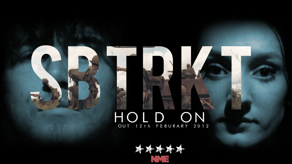
This is the advertisement from NME magazine which is promoting the release of our artist's new song which was released in February 2012. The font for the advert is quite basic due to the fill effect which encompasses the images of a modern day battlefield. This is useful because an overpowering font would distract from the symbolic imagery used. The song is called 'Hold On' which is ambiguous when it comes to the deeper meaning. One meaning could reflect the struggles of the soldiers used on the advertisement, telling them to 'Hold On'. The contrast in colour between the battlefield image and the man and woman behind the text could show the ambiguity and how the song also references to a couple and perhaps relationship struggles, making 'Hold On' another accurate term. The faces are shown through a blue tint creating quite a ghostly effect, shrouded by black to create an overall dark image with negative connotations.


The font for the magazine advertisement is quite basic and bold which is the norm for SBTRKT and their other forms of advertising. There is usually more of an artistic style to the font but this has been abolished for the magazine advertisement because there is imagery inside of the text. A normal, non-distracting style is best for this reasoning so the picture can be seen clearly.
There is a blue hue on the face of the woman in the magazine advertisement. This connotes depression and sadness which relates to the emotional song. Blue also has a calming effect which could reflect the slow tempo of the song and create an overall relaxed mood against the harsh war imagery. The blue face fades in to a black background which creates an effect of fading away or fading into an abyss.
The war imagery has quite a harsh effect and really impacts the audience due to the severe nature of war and the battlefields. The term 'Hold On' could be about the current soldiers "holding on" in their lives while fighting in the war. The realism of the musky image of the army soldiers creates a true-to-life, hard hitting representation of the war which can be generalised to any audience due to the vast amount of wars going on all over the world.
The thing I like the most about the whole magazine advertisement is that the symbolic and ambiguous nature of the design draws in a wider audience due to the vast meanings and significance it could possess. I have been inspired by this magazine advertisement and hope our ancillary tasks create such an effect.
No comments:
Post a Comment